


It is the colour of the year of 2020 – clothing, furniture and wall colours in blue are conquering our homes. In nuances ranging from soft sky blue to the commanding royal blue, the attractive basic colour attracts the eye. A favourite colour of many, it's easy to combine – even in its most vibrant varieties.
It answers to the melodious, albeit not exactly catchy name PANTONE 19-4052 TCX. As of late, it's also commonly known as “Classic Blue”: This is the Pantone colour of 2020, which is now setting the tone in fashion and interior design. It has already made its way into countless boutiques and furniture stores and is gaining more and more fans. Although it's an opaque and anything but subtle colour, it offers a wide range of possible combinations. From natural and maritime to royal high-gloss finishes, Classic Blue can help create a wide variety of styles.
Background knowledge: In the past, blue was considered the colour of the Virgin Mary. Yet from the 1920s on, blue was increasingly being used for uniforms and work suits. The colour is associated with boys and men to this day.

Although it's the colour most often mentioned by Germans as their favourite, many still shy away from painting their homes blue. The fear of overwhelming the viewer and of getting tired of the popular hue too quickly tempts us to turn to a more classic, neutral choice of colour. That's fine, as blue is also an excellent choice for colourful accents in an otherwise restrained environment.
Furniture and decorations in blue contrast in many respects with natural-looking surfaces and attract attention without seeming too dominant. On a wood flooring with a harmonious design, for example, a carpet in rich blue becomes a real eye-catcher.

The special advantage when furnishing in blue: It always reminds us of beautiful skies and tropical seas. That's why it has such a calming effect on the observer and helps soothe our urge to travel. This effect is enhanced when the blue is combined with white to create a high contrast. This is a timeless duo, as the maritime style is considered a true evergreen – after all, striped sweaters and similar items regularly make their way back into the shop windows of fashion stores. And what could be better suited to this interior design style than a rustic wood flooring reminiscent of the weathered planks of a ship en route to distant lands?


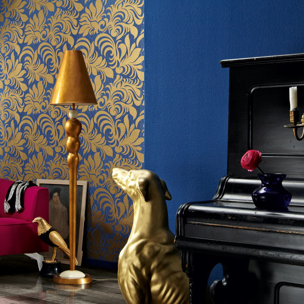
For centuries, blue has been regarded as the colour of kings. Even today, it's easy to demonstrate a sense of royal elegance by combining this colour with precious metals. Accessories in silver, gold or copper harmonise perfectly with Classic Blue. It's important not to get carried away and mix too wildly, but to limit yourself to one metallic tone.
Either black or white makes a good choice as the second dominant colour tone besides blue. Both are associated with seriousness and elegance and tastefully complement the noble interior design style. Finally, your personal throne room will be rounded off effectively by an easy-to-maintain design flooring in marble look.


